Looking to boost your real estate business in 2023? Dive deep into the essentials of cutting-edge real estate website design. From user-friendly navigation and high-quality imagery to showcasing local expertise and integrating client testimonials, discover the must-have elements to attract potential clients. Embrace the future with optimized SEO, mobile responsiveness, and innovative design trends. Your standout website is the first step to dominating the real estate market. Dive in!
What is Showit?
Showit is a web design platform that offers complete control to creative professionals and entrepreneurs to build a website. It is a drag-and-drop platform that provides design freedom without needing custom coding. One of the main benefits of Showit is the ability to create a mobile site easily, ensuring that visitors have a seamless experience on any device. With Showit, there is no need to compromise design to optimize for mobile.
Showit is known for its beautiful pre-made templates and exceptional customer support team. It is an excellent option for photographers and creative professionals who want both complete control over their website’s design and a platform where they can easily edit their website. The Showit platform is easy to use and offers creative freedom without requiring any custom coding. With Showit, users can easily customize a Squarespace website or old blog and migrate to a new site without worrying about technical issues.
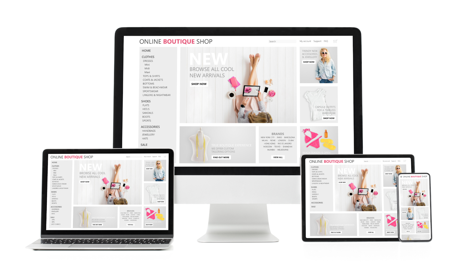
Showit integrates with other website builders and offers several templates that cater to the needs of different businesses. The Showit website design editor is user friendly, and building blocks can be customized to meet individual needs. The platform offers various Showit templates that can be easily customized to match the brand’s aesthetic. With Showit, creative businesses can have a new website up and running in no time and hit publish when ready.
Here you can learn Showit’s search engine optimization capabilities and how to make the most of them to achieve the best possible rankings for your photography website.
Is Showit good for SEO?
The short answer is yes, Showit is good for SEO. Showit offers a number of features and tools that can help website owners improve their website’s SEO performance. For example, Showit’s platform is built on WordPress, which is known for its SEO-friendly architecture. Showit also offers customizable meta tags, descriptions, and titles, which are essential for optimizing your website’s search engine visibility.
Additionally, Showit offers the ability to create sitemaps and add alt tags to images, which are important elements for improving website accessibility and search engine optimization. Overall, if you’re an online business looking for a website builder that can help you improve your SEO strategy- then Showit is definitely worth considering.
While it is possible to rank highly on Google with Showit, you’ll need to consider several critical factors and extra steps for excellent search engine optimization performance.
Assuming you are using Showit 5, have an SSL certificate, and your WordPress site address and URL display https- here are some Showit tips that will focus on aspects unique to Showit SEO.
Pre-requisites and choosing the right package
Showit offers its hosting platform in three packages: Showit, Showit + Basic Blog, and Showit + Advanced Blog. The Advanced Blog package is the only viable option for those serious about SEO. The Basic Blog package has several limitations, such as being unable to add plugins outside their pre-installed list, being part of a multisite installation, and needing FTP or database access.
Fixing legacy issues and migration to Showit
Significant technical issues encountered with Showit websites occur during the initial migration process. If you’re migrating a website from the Squarespace or WordPress platform, then pay close attention to the following settings to avoid negatively impacting your rankings: WordPress Site Title & General Settings, Permalinks, WordPress pages, Plugin settings, Redirects, and Canonical Address (www).
Basic SEO settings – Quick Review

There are several basic SEO settings to be aware of within Showit. These include Analytics (UA code), Page Title, Meta Description, Meta Keywords, Share Image, and Advanced Settings. Familiarize yourself with these settings and follow best practices to improve search engine optimization performance for your website.
Sitemap URL for Showit website
With Showit, the sitemaps for Showit pages and WordPress Pages/Posts are separate. If you’re using Showit pages, it’s recommended to submit the Showit site sitemap to Google Search Console. You can find the sitemap for Showit pages by adding /siteinfo.xml to the end of your domain.
Example: https://robbenmedia.com/siteinfo.xml
Images (alt text vs. title)
When optimizing images within Showit, there are three ways to insert an image: Standalone images, Gallery of images, and Canvas background. Each method has different SEO settings available, and web designers need to know how to optimize each type of image for better search engine visibility.
Design and SEO Best Practices on Showit site

Showit offers a range of attractive templates, including free and paid options, or you can create your site from scratch or combine templates. The following best practices should inform your decision when building or selecting a design template for your business website.
Use canvas views wisely
Canvas views are a unique feature of Showit and are helpful for various purposes. They work well for slideshows, testimonial sliders, and displaying galleries without opening a new page.
Technically, the Showit website builder handles canvas views well, with lazy loading for objects like images in sliders. Google can render and index content within initially hidden canvas views. However, canvas views have some drawbacks, so exercise caution when using them. Showit’s navigation customization between canvas views is not found in most other page builders.
Consider the following when using canvas views:
- Google may prioritize initially visible content for ranking. Avoid hiding important content for a good user experience in an initially hidden canvas view.
- Users expect specific navigation for certain functions, especially on mobile devices (like swiping through a slideshow). Don’t sacrifice usability for creativity.
- Canvas views can make visitors feel like they’re on a new page with changed navigation, causing confusion. Refrain from disorienting visitors with a complex web of canvas views.
- Don’t use canvas views for content that could be an independent page likely to receive search traffic.
- If tracking form submissions in Google Analytics, consider using a thank you page instead of a thank you canvas view after form submission.
Pay attention to object order
In the Showit platform, the layer order of objects determines their appearance in the HTML of the page. The objects at the bottom of the layer list appear first in the HTML. Use a text-only browser or the text-only Google cache to understand how Google reads your page.
Here are three tools to view a “text only” version of your website:
- Google cache (text only version)
- Textise
- w3td Text Browser Tool
Avoid using multiple fonts for a single line of text Showit designs often include multiple fonts in one line of text. While this is possible, it could be more optimal, as separate H1 headings are created in the code.
Regarding <div> and <p>, consider the following HTML element tags in Showit:
- <div> – A generic tag for “division” (or section). It can be used safely anytime.
- <h1> – The main heading. Use only once per page.
- <h2> – Secondary topic headings.
- <h3> – Subheadings belonging to a parent H2.
- <nav> – Main navigation. Use only on main menus, not buttons or other links.
- <p> – Paragraph. Another generic text tag that can be used safely anywhere.
The Chrome extension “headingsMap” helps examine a page’s heading structure. HTML headings (H1-H3) should indicate the hierarchy of your page. Use H1 once per page for the main topic and H2 and H3 tags to outline your content.
For text elements not part of your main navigation or content structure, use the <p> or <div> tag.
Use <nav> for the main menu, not headings. Avoid using H1-H3 tags for your navigation. Use the <nav> tag for the main menu and, if necessary, the <div> tag. Many Showit sites mistakenly use heading tags for their primary navigation, which should be avoided.
Be mindful of “off canvas” items
In Showit, any objects placed off the visible canvas while editing your site won’t be visible to website visitors but will still appear in the code and be visible to search engines.
A common issue is that template or demo content gets moved off the canvas but needs to be deleted during site customization. This can result in “Lorem Ipsum” content being crawled by Google and even triggering a “translate this page” option in search results. Make sure to remove such content to avoid potential SEO issues.
Avoid creating separate objects for mobile and desktop

While it’s sometimes easier to create two versions of an object and hide one on the desktop version and the other on mobile when responsiveness is an issue, this approach should be used sparingly. Google is likely to see both versions and prioritize the mobile one.
What occurs when items are hidden from desktop or mobile?
When an object is hidden on both desktop and mobile, it won’t be rendered in the final HTML for the page and will be invisible to both visitors and Google. If you hide an item from either the desktop or the mobile version, the CSS property “display: none” is applied for users with that screen size. Google will crawl, render, and index both versions but may deprioritize objects with “display: none.”
Using Showit as a Web Designer for WordPress Page Building
Showit can be a comprehensive WordPress page builder- however many users and designers don’t use this feature. Here, we’ll discuss how to integrate Showit and WordPress effectively.
Showit pages vs. Blog templates
In the Showit builder’s “Site” tab, you’ll find “Pages,” “Blog Templates,” and “Site Canvases.” These templates are flexible and can be used for much more than just styling the layout of a page, post, or 404. The “Custom” option lets you create and customize a template for anything in the WordPress template hierarchy, opening up numerous possibilities with Showit.
Benefits of using WordPress pages
Using Blog Templates in Showit offers several advantages, including adding a “featured blog posts” section to the page and incorporating dynamic content from WordPress. Other benefits include:
- A unified sitemap.
- A consistent <head> section.
- The ability to use plugins to control the page.
Mapping a WordPress template to a WP page
Setting up a WordPress page and Blog Template in Showit can be relatively easy if you’re familiar with the process. You’ll need to create a page in WordPress, find its ID, and then copy your Showit Page to a WordPress template.
Using Yoast
Yoast is a popular SEO plugin that can be used on Showit with the Basic Blog and Advanced Blog packages. It replaces the SEO features from the Showit builder- however it cannot analyze the content built primarily in the Showit Builder.
WordPress Block Editor (Gutenberg) and Showit
The default WordPress editor since version 5.0 has been the block editor (code name Gutenberg), which has improved significantly over time and can be safely used with Showit. If you’re starting with Showit and WordPress, it’s recommended to familiarize yourself with the block editor instead of installing the classic editor plugin.
Implications for Showit Users

While Showit has many innovative features, there are several reasons why some may not recommend it, such as encouraging users to create site website templates that could be more easy to use, concerns about cross-browser/device compatibility, and issues with search engine optimization in many designs. The platform also struggles to future-proof its technology and provide adequate technical support.
However, as the Showit platform can be used as a WordPress page builder and incorporate best practices, it remains a go to option for photographers. If you need help maximizing your Showit site’s search engine potential, you could consider hiring a consultant.
Overall, Showit is a powerful custom website builder that offers full control and design freedom to creative entrepreneurs and professionals alike. It offers a user-friendly interface, beautiful pre-made templates, and exceptional customer support team.

While it is not as powerful as other website design platforms like WordPress, Showit offers a range of exceptional features that make it an attractive option for online businesses. By following the right steps and using best practices, users can optimize their Showit websites for better search engine visibility and achieve the best possible rankings.
FAQs
Q: How much does it cost to have a Showit website?
A: Showit’s pricing starts at $19/month for the basic plan, which includes hosting, unlimited galleries, and the ability to design your own website with their drag-and-drop builder. The advanced plan starts at $34/month and includes additional features like e-commerce capabilities and advanced search engine optimization.
Q: What is the difference between Wix and Showit?
A: Wix and Showit are both website builders, but there are some key differences between them. Wix is a more beginner-friendly platform with a larger variety of templates and plugins, while Showit offers more creative control and customization options. Showit is also more focused on designing websites for photographers, artists, and other creative entrepreneurs.
Q: Why is Showit better than Squarespace?
A: Showit is often preferred over Squarespace by professionals because it allows for more creative freedom and customization of their website. Showit’s drag-and-drop builder and flexible design options make it easier to create unique and personalized websites. Additionally, Showit is known for its excellent customer support and user-friendly interface.
Q: Is Showit better than Shopify?
A: Showit and Shopify are designed for different purposes. Showit is a website builder for creative entrepreneur, while Shopify is an e-commerce platform for businesses that want to sell products online. If you’re a creative professional who wants to sell products online, Showit’s e-commerce capabilities may be sufficient for your website needs. However, if you’re looking for a more comprehensive e-commerce solution, Shopify may be a better choice.
What we’re about to tell you may shock you, so it might be best if you’re sitting down to hear this.
Are you ready?
Website traffic doesn’t matter. It’s useless… unless, and this is the whole point today, you’re converting that traffic. But before we get into ways to improve conversion rates, let’s first define it.
What is a Conversion Rate?
If you already know this, bear with us; the good stuff is coming. A conversion rate is the percentage of website visitors (or Facebook ads traffic) that you convert. So, the next question is this:
What is a Conversion?
A conversion can mean many things but the essence of it can best be summed up with another question: What are you asking this traffic to do? 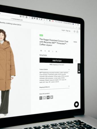
Obviously, if you’re asking for a sale and you get it, that’s a conversion. However, a conversion can be something as simple as getting a click-through in an email, getting someone to fill out a form, or persuading visitors to reach out via email or phone.
Whatever you’re asking, no matter what it is, a conversion is simply an affirmative response to your CTA. It’s about persuading your audience to do what you ask of them; it’s a little more Jedi and a little less business owner.
(By the way, getting email addresses – list building – is pure gold and something you should be strenuously focused on.)
What is a CTA?
CTA is short for Call to Action. This is the ask. In this guide, we’ll be showing you proven strategies that will guarantee that your CTAs are as persuasive as possible. But first, to illustrate how important conversion rate optimization (CRO) is for the growth of your business, we’re going to do a little math… apologies in advance.
Let’s say that Business #1 gets 1000 visitors a month, while Business #2 gets 10,000. Business #1 has a conversion rate of 2 percent, while Business #2 sees a conversion rate of .10 percent. The math that follows is why traffic alone is meaningless:
Biz #1: 1000 visitors X 2% = 20 conversions per month
Biz #2: 10,000 visitors X .1% = 10 conversions per month
By the way, according to studies, the average conversion rate for landing pages is around 2.35 percent, and this is across industries. If you’re in the top 25 percent, your conversion rate will be around 5.31 percent. And if you’re in the top 10 percent, your conversion rate jumps to revenue-bursting 11.45 percent.
Are you ready for some strategies that will vault your conversion rates into the top 10 percent? We thought you might be.
15 Strategies to Improve Conversion Rates?
The strategies that follow require a little CTA psychology – using psychological triggers and persuasive techniques to elicit the responses you want.
What’s required from you is this: You’ll have to use empathy and put yourself in your target audience’s shoes.
You’ll also have to start thinking like a business psychologist rather than a business owner or entrepreneur.
1. Less is More
Ever heard of KISS – keep it simple, stupid? Not only does it apply in sales, but it also applies when unleashing your marketing strategies on visitors or subscribers.
Are you using an optin form to build your list? (In case you’re not sure, the answer is a BIG yes.) Stick to the basics, unless you have great reasons to deviate. The basics are first name and email address. With each box you add to your form, you can expect diminishing returns, as in fewer signups.
Less is more also applies to your landing pages… all of your static pages, really. And we’ll be digging into some specifics throughout this guide to optimize conversion rates on all of your pages.
2. Speak to Your Audience, Not at Them
There is a distinct way your target audience speaks and thinks, unless you’re Walmart, in which case, your target audience is everyone. So, first, define your target audience, and then tailor all marketing copy specifically for them.
Do you think lawyers speak differently than teachers or business owners? You better believe they do. Not sure how your target audience thinks or speaks – the words they use – to go LinkedIn and input your target audience’s job title into the search bar. Then read through some of their profiles, and make a list of the most commonly used words.
3. Use Offers to Improve Conversion Rates
Here’s an example you might appreciate: You land on a website and see an optin box asking for an email address. They offer nothing. You go to another site and see an optin box, but this time, they’re offering you a detailed guide about how you can improve conversion rates in return for your email address.
Which site gets your email address? Incidentally, once you have someone’s email address, you have permission to market to them. And if you don’t abuse that permission, you can nurture that prospect until you persuade her or him to become a customer.
This also applies to email marketing, since we’re on the subject. Companies like WinZip use offers all the time to improve conversion rates. If your list members gave you permission, they likely are interested in what you’re selling. Now, just give them a good reason to do what you’re asking of them.
4. Understand How Visitors Read Online
First of all, hardly anyone reads anymore. We skim now. Our attention spans have dwindled to the point where a 30 second TikTok video is considered too long. Yes, it’s out of control. But what does this mean for you?
Write copy specifically for skimmers. This means using headlines to tell the whole story. After all, you cannot count on them to read what’s in between the headlines. But this also applies to areas of a web page and how visitors’ eyes tend to track.

Do you know what part of a web page is seen the most or seen the least? These details are essential when you’re talking about moving the needle a percentage point or two. Web site visitors’ eyes track in an F-shaped pattern, which means you should be putting the important stuff on the left side of the page, as this image from Crazy Egg shows.
Here a few more tips to improve conversion rates with this information:
- Use visuals more often, but only if they achieve your page or ad objectives; graphics grab attention.
- Use contrasting fonts and colors to do the same.
- Use directional cues, like arrows, to point visitors where you want them to go.
- Use white space liberally to make important things (CTAs, benefits, etc.) stand out.
5. Ask, Ask, and Ask Again
Ask and ye shall receive. Don’t ask and… guess what happens?
Include at least one CTA on every web page, email, PPC ad, home page section, etc. Never miss an opportunity to ask your visitors, email subscribers, or social followers to do something that will benefit you. But you’ll still need to ask the right way – which we’re getting to – which means putting on your marketing psychology hat for the rest of this guide.
One other important thing few people mention with CTAs: Clarity wins the day. If you want someone to click-through, tell them to click-through. If you want someone to reply to an email, tell them to hit the reply button. You can’t ever be too clear with what you want.
Here are a few more thoughts on using CTAs effectively:
- Buttons perform best because they are more easily seen.
- Action verbs also work best – grab your free ___ today, reserve your spot now, sign up below, etc.
- Use popup optin boxes, but also use them in a way that doesn’t annoy visitors or violate any of these 15 strategies to improve conversion rates.
6. Consistency is King
Well, consistency and content, that is. Imagine a Facebook ad that’s about losing weight, clicking on that, and then landing on a page about muscle growth. OK, maybe a bit of an extreme example, but every part of your funnel must be aligned in its messaging.
This means your ads, your website copy, your landing page copy that’s expected to convert, your emails… every part of your funnel must include a consistent message.
Here’s the thing with people and websites in particular: Once they leave, they’re not likely to return. So, don’t give them a reason to leave.
7. Benefits not Features
We mentioned benefits a while back and this is the number one way to improve conversion rates. Let’s use another example.
You desperately want to lose weight. You’ve tried everything and nothing has worked. You click through from an ad or email and get to a landing page with a headline that reads – Our special botanical blend of herbs blah blah blah.
Now imagine landing and seeing this headline: Lose the weight and keep it off.
The first example is feature centric, as in us, our product, our company. The second example is benefit-centric, as in you, your pain point, what you want.
See the difference? If you take away one thing from this guide it should be this: Always lead with benefits. Benefits create emotion and emotion is that magical land where buying decisions are made. (Take our home page for example, we lead with benefits.)
Now, there is a place for features. Features provide the reasoning and logic to back up that buying instinct. So, don’t toss those out; but don’t lead with them either.
Benefits should particularly show up in email subject lines, headers for marketing copy everywhere – PPC ads, landing pages, other static pages – and especially in CTAs. Try pairing your CTAs with the strongest benefit (or pain point) and watch conversions soar. Execute it like this:
If you’ve had trouble losing weight in the past, we can help you. Click the Buy button below and you’ll be slimmer and fitter than you ever thought possible.
When you speak about benefits, you naturally use the word you more often, and this is important because it allows you to speak directly to your target audience. You is what’s known as a power word when it comes to creating persuasive marketing copy. And you should use it often.
8. Landing Pages Without Distractions
If your landing pages have more than one direction for visitors to go, tsk tsk tsk; that will not do.
Your landing pages aren’t like other pages. There shouldn’t be a footer, or a sidebar, or a menu. Landing pages should have one place to go, and your CTA will determine where that one place is. So, use some software if you have to, but create real landing pages, not normal static pages posing as landing pages.
Since we’re on the subject of landing pages, you should also follow Improve Conversion Rates rule #1: Less is more. If you’re only asking for an email address, try keeping the entire page above the fold. And remember to keep those optin forms down to as few asks as possible.
9. Test Everything
Do you know why digital marketing is so much more beneficial when compared to other types of marketing? You can measure everything in real-time and make adjustments as you go.
Fine-tuning is expected. If you’re not paying attention to your metrics and making changes, you’re not maximizing your digital marketing return; yes, we’re talking about ROI. Let’s use email marketing as an example.
The three key metrics and what they’re related to:
- Open rates – subject lines
- Click-through rates (if you’re asking) – CTAs, offers, benefits, persuasive elements – we’re getting to these
- Conversion rates – same as CTR above
If your audience isn’t opening emails, you know what you need to fix. If they’re not responding to your emails – CTR or conversion rates – you know what you need to fix.
10. Ask for a Date, not Marriage
This is why building an email list is so vital. We consumers prefer to be courted for a while. We generally don’t make buying decisions on the first go. So, nurture those relationships, and don’t propose on the first date.
11. Use Social Proof
There are six elements of persuasion:
- Likability
- Consistency
- Authority
- Scarcity
- Reciprocity
- Social proof
There are books written solely about these elements of persuasion, so we’ll be briefer here. Social proof is what your customers have to say about you, your product or service, and your company.
These can be reviews, customer testimonials, word of mouth, social posts, blog comments; any forum in which people are commenting. But for our purposes here today, let’s focus on testimonials.
If you have them and they’re good, use them… a lot! (Again, we certainly do this like the one below.)

Put them in emails. Put them on landing pages. Just get them out into the world in as many ways as you can. Who better to sell your products or services than your satisfied customers? Do you want to know what your audience will think?
Well, if it worked for this person, it should work for me.
12. Likable
You probably won’t be able to use every element of persuasion and certainly not all at once, but some are more important than others, and being likable is one of those.
We tend to do business with people we genuinely like and get a good feeling from, so use this. Emails especially are more personal than other marketing mediums. Don’t be too stiff when creating email copy and don’t come off as a jerk. I’m sure you’ve gotten emails where the tone is less than friendly.
One way we can portray ourselves as more likable is by coming across as helpful. As a business owner, your CTAs and marketing copy should be worded as such: We exist to help you.
13. Authority
Let’s continue with our weight loss theme. Whose weight loss marketing copy will come across as more reliable: Joe Schmo or Dr. Lose Weight?
If you are an expert, don’t shy away from it. Lean into it. Just remember to do it in a way that’s also likable. And remember, this is a feature, so don’t lead with your authority; use it to back up your benefits. Let’s use About pages to illustrate.
An About page is typically about the what (us). But if you can concentrate on the why (them), it’s more persuasive. How about we use Dr. Lose Weight’s About page as an example.
I created ___ because I saw how much my patients were suffering from ___. Continue on for a paragraph or two about helping the reader and providing benefits to your target audience. And afterward, dive into the features; in this case, experience, credentials, education, etc.
You create emotion then back it up with logic, and boom – you’ve got a conversion. And yes, there should be a CTA on your About page, too.
14. Scarcity
WinZip uses scarcity well in their email copy. They tell you about a product, make you an offer, and then put a time limit on it. You’ve probably seen Shopify e-commerce pages that tell you how many of a certain product is left in the inventory. Do you want to know something? That product is probably always on the verge of being sold out.
Losing something is more powerful than gaining something. This is true in relationships, too. Your significant other is getting attention elsewhere and suddenly you want her or him more than before. Consumer psychology is everything when creating persuasive marketing copy.
15. Stronger CTA Copy
Take everything you’ve learned here today and use it to maximize your CTAs. This is the best way to improve conversion rates immediately.
Improve Conversion Rate Conclusion
As you now see, improving conversion rates is more about understanding human psychology than anything else, and it all begins with empathy. If you can put yourself into your target audience’s shoes, your marketing copy will be strong.
Yeah, this is some Jedi mind-trick stuff we’re talking about. But the question is:
Are you ready to be a Jedi?
Many of you believe you have a traffic problem. What if I told you, you actually have a conversion problem?
Take this example.
- Green Road Flowers gets 1,000 visitors to their site each month and they receive 37 online orders.
- Island Flowers gets 600 visitors to their site each month (40% less) but they get 88 online orders.
Common sense tells us Island Flowers and their 88 orders has a better business than Green Road Flowers and 1,000 website visitors.

This goes to show an increase in traffic doesn’t always mean an increase in profits. An increase in conversions always means higher profits.
To improve profits and return on ad spend, turn your focus to conversion rate optimization (CRO).
CRO will save you a million headaches by turning your traffic into a consistent flow of new leads and sales.
Growth is what it’s all about anyway, right?
What Is CRO?
Before we jump into conversion rate optimization, let’s define a conversion.
A conversion is when you get a user to take the action your business desires. Most often this desired outcome is getting them to purchase.
Conversions can be any one of these depending on the business and their objective:
- Getting a sale
- Receiving a phone call
- Scheduling a consultation
- Watching a webinar
- Downloading a mobile app
- Collecting an email address
- Following a social media account
Now CRO — conversion rate optimization — happens when you analyze how to increase the conversions of your traffic from paid ads or SEO. This execution often involves improving the website pages, or a specific landing page, to boost conversions.
At a high level, the CRO process is about improving the website visitor’s experience on the website. We’ll get into how to do this. For now, know the better the user experience, the more likely you’re going to get them to take the action you desire.
Focusing on conversions is arguably the most direct — point A to point B — method to acquire more customers and fill up your lead pipeline.
Marketing Strategy
Now we’re about to get into tactics. But please remember this: Strategy first, tactics second.
While there are many different types of conversions you can go after, and we’d argue you should focus on one desired path for visitors per page, a conversion is only as good as the overall strategy.
You can rack up conversions left and right. But if they’re the wrong type of conversions for your business or audience, this is all for nothing.
Instead, start with an effective strategy to increase revenue, profits, or brand awareness, and have your core reasons for doing so. Then choose the one specific conversion — purchases, new customers, YouTube subscribers — to accomplish your goal.
This way your CRO is aligned with smart strategy. And you’re not a hedge fund who finds itself optimizing for TikTok followers instead of assets under management. (That’s a ridiculous example, but you get the point.)
Why Conversion Rate Optimization Wins
What if you could press a button that both generates more revenue and takes zero additional investment (or saves you money)? That’s the power of CRO.
After implementing these tweaks to your landing pages, you’re sure to generate a higher return on ad spend (ROAS).
Here’s why.
CRO Improves Revenue
We’ve touched on this before. The more conversions your website brings in, the more dollars you make.
This may turn into immediate revenue if you’re improving ecommerce marketing conversions by receiving more daily online purchases.
Or it could be a longer sales funnel that pays significant dividends. Say it’s a B2B professional services site where the end conversion goal is to capture an email and then send an invite for a sales call.
No matter how it’s done, revenue is the oxygen of any business. And CRO is a data figure that’s central focus is to improve revenue.
Plus, think about it. Anyone with an ounce of wisdom knows that a business can go without elite branding or hundreds of thousands of followers. But deprive it of sales, and it’s quickly a sinking ship trending toward bankruptcy.
If you could use more revenue growth, use conversion rate optimization.

Speaking of, we recently used principles in CRO to improve the conversions of an immigration law firm to the following:
- 617% increase in inbound leads
- 42% increase in conversion rate
- 48% decrease in cost per lead
Safe to say this law firm loves us and is going to send us a nice Christmas present this year!
Because we’ve done it for customers over and over again, I know how much of a difference maker it is.
CRO Maintains Or Lowers Ad Spend
More money? Great! But where’s the catch? There’s not one.
You’ll be able to generate more cash without having to spend more of your advertising budget. Oftentimes, you can spend less on ads once you fine tune your website conversion strategy because now you’re getting the absolute most out of every dollar spent.
Let’s say you’re a physical product ecommerce store. You used to spend $30,000 per month on Facebook ads to sell out. Now you’re selling out of your products after only spending $20,000 the month after implementing CRO.
That’s a savings of $10,000 per month.
You can reinvest this money into more inventory, customer service, new products, employees, and fulfillment. You can secure backlinks for better organic search results. Or you can pocket it.
Name another activity that increases your revenue and decreases your expenses? That’s why we’re extremely bullish about this process.
Effective CRO Tests & Experiments
If you’re new to this, maybe you don’t know how many page views you get per month. Maybe you have Google Analytics set up, though you can’t make out the traffic information. Or maybe you know everything about your traffic and where it comes from, you’re just stuck on conversions.
In any case, the first step is to run a conversion test on your current website traffic. Then you can make positive changes to improve conversions.
Like David Ogilvy said, “Never stop testing, and your advertising will never stop improving.”
A/B Tests
An A/B test, or a split test, is the process of sending traffic to a landing page where one variable is isolated and different from the other test.
For example, on landing page A the contact form is above the fold and on landing page B the form is below the fold.
By sending the same amount of traffic to each landing page where everything else is the same — besides the form placement — you’ll see what form produces more submissions. That will be the winner of the A/B test.
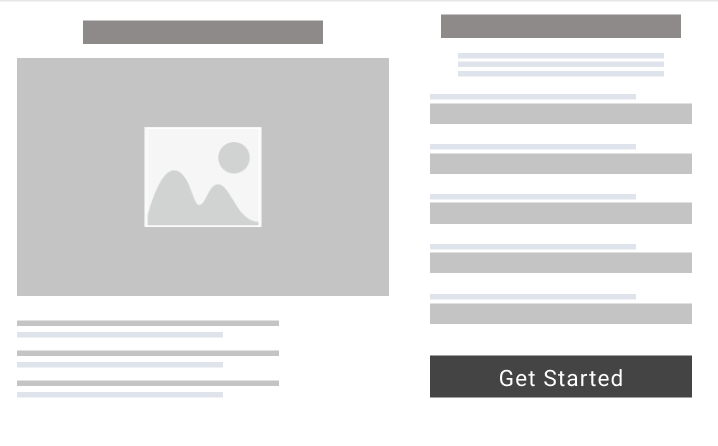
The “A” In The A/B Test.
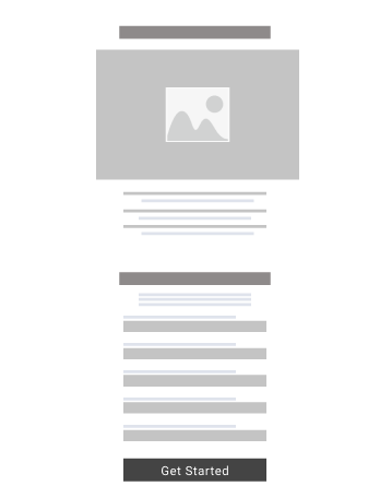
The “B” In The A/B Test.
Then, if you’re smart, you’ll go onto test how the headline is worded while keeping everything else the same. And then test the button wording, and then button color, on and on.
You can then take the winning result of each A/B test and go on to test another variable. Do a few split tests and put all the winning combinations together. The idea is your landing page will be significantly improved for conversions.
(Word of warning: don’t go insane and overdo it. Once you have a well performing page, leave it. There’s the temptation to test forever but you’ll hit the law of diminishing returns.)
Different Tests To Run
The number of A/B tests you can run is ridiculous. Look out for a blog post dedicated to that in depth.
For starters, go for the tried and true conversion tests in this list below for your landing page:
- Number of columns – 1 column versus 2 versus 3
- Hero and background images – for example, does an individual smiling or straight faced perform best?
- Number of contact form fields – do shorter forms or longer forms convert better?
- Text copywriting – word choice is huge in winning over new customers
- Positioning of forms and call to actions – can your form be at the top of the page or do you need to build trust and share the benefits before asking for the purchase?
- Video versus image – run the test to know what’s best for your landing page
- Colors in your button, font, and website
- Pricing – does a high price with a discount convert better than a standard price?
- Payment options – what does adding a monthly plan to your annual plan do?
- Checkout process steps – can shortening the checkout process improve sales?
- Bonuses – how does adding a money-back guarantee, free shipping, or an additional item convert?
- Trust factors – do customer testimonials, reviews, or customer logos help or hurt the page?
Multi-Variable Tests
A/B testing is running an experiment that isolates one individual element of a landing page, say the ‘Add to cart’ button color.
Now multi-variable testing is analyzing the performance of two landing pages when they have more than one element different about them. For example, the headline text, the copy, the form placement, the image, and the button colors are different between the two pages tested.
If it helps, think of multi-variable tests as multiple A/B tests at once.
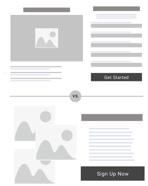
Now I’m personally not as big of a fan about these tests. For one, it’s difficult to determine why one landing page performed better than the other when many elements are different. And two, it can drive you mad, plus waste serious time, trying to determine what caused the better performance.
Though it’s better than not testing at all. Multi-variable tests can provide helpful information. I’d say they’re most valuable when you’re in a time crunch and don’t have time for all the different A/B tests.
However, if you have the extra time to run multiple A/B tests, then that’s my recommendation to get clear data.
Live Tests
This third option is difficult to scale, though extremely effective.
By doing what I call live tests (in person, on the phone, or screen watching), you can collect raw feedback on the spot.
Start by asking customers to go through a landing page and then ask them questions like:
- What’s this page communicating primarily?
- Who is the target audience? What benefits do they receive?
- If you were going to buy, is it clear where to click to buy?
- What additional questions did you have that were not answered on that page?
- Did you feel friction at any moment during your experience?
If you want a more passive route, there’s screen recording software like Hotjar (paid tool) that allows website owners to watch the exact replay of how users interact with their pages. This can be insanely informative if you’re running tests, users aren’t converting, and you’re still unsure why.
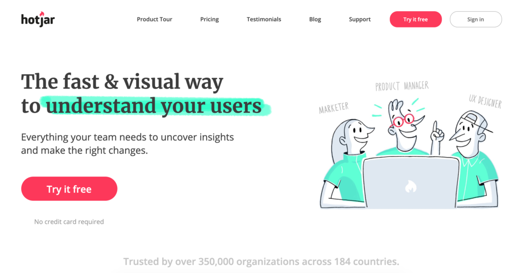
I know hundred million dollar companies that spend time watching how people interact with their website. If they think it’s an important factor to improve their CRO, odds are you should too.
Conclusion
The big idea is this: if you’re struggling to convert traffic, don’t spend another penny on PPC ads or SEO until you fix your conversion rate optimization (CRO) problem.
There’s no reason to throw good money after bad. And that’s exactly what you’re doing to get traffic to your site that doesn’t convert to a lead or paying customer.
Invest in conversion optimization to make the most money out of your current site traffic. It will change your business forever.
Once this problem is solved, you can pay for new traffic with absolute confidence you’re making a solid ROI. Then the race to scale is on!
Want to make more money from your ads or SEO campaign? Then you need to understand CTA psychology.
Because when you consider your prospects mindset and what motivates them to click, you can completely transform your conversions and sales.
As our business has evolved, we’ve started to look at our content through a different perspective, one focused on our call to actions. The results are breathtaking.
If you think about it, a 20% increase in conversions on a landing page or button tweak is a 20% increase in profits. Huge!
Using CTA psychology has evolved the way we get customers to convert. We want to help you do the same.
Continue reading to learn how you can improve yours.
What Is A Call To Action?

A CTA, or call to action, is a tactic used to suggest your audience takes a specific action. This can be buying a product, scheduling a consultation, or following your business on Instagram.
A clear CTA will persuade customers to take the next step, in the form of a button or link, and do what you desire them to do.
An example of a CTA would be a Facebook post with an additional button that says “Buy Now” or “Shop Now”. Once a user clicks on that button, it will take them to a landing page that has the offer that was featured in the post.
The average conversion rate for a landing page is only 4.02%. That means most of the people that visit your website aren’t buying anything.
Adding effective CTA’s to your website is the solution for this as it gives users the final push they need to buy.
Whether you’re a small business just starting out or a large business that has been thriving for decades, you need to start implementing persuasive CTAs. These are at the heart of CRO. (Wondering what is CRO?)
Otherwise, you’re wasting marketing dollars, and potential sales, left and right.
What Is CTA Psychology?

Buyer psychology is the secret code to unlocking your customer’s greatest needs and having them spend all of their money with your company.
Knowing that, CTA psychology is the idea of applying psychological principles to understand what motivates consumers to take the next step with a business.
Most businesses only focus on the surface level aspects of CTA’s, such as:
- Font type
- Placement
- Color
- Copy
- Other design aspects
These are important, but they can’t fully explain why users actually click on something in the first place.
CTA psychology goes beyond design and copy. It focuses on the “why” of consumer behavior.
You can use this concept to create call to actions that coincide with the psychological behavior of the consumer. And everyone knows understanding your consumer is one of the core concepts of marketing.
So combine design elements and psychology principles to take your business to the next level and increase your conversion rates.
Alright, now let’s talk about how you can use this to improve your business.
10 Ways To Improve Your CTAs
1. Offer Limited Time Only Coupons
People hate to feel like they’re missing out. FOMO (fear of missing out) is a real human condition.
We see this in everyday life. You feel upset if you see that your coworkers are getting dinner together and didn’t invite you. Or if your friend is having a birthday party and you can’t go, it’s the worst feeling in the world.
This idea can be applied to offering coupons to your customers.
If there’s one thing I know for certain, it’s that people don’t like to lose out on saving money. Coupons are an opportunity for customers to receive big savings.
Combining this fear of missing out with the desire to save, many consumers who are encouraged to click on a coupon will do it and spend more money with your business.
To really guarantee that a customer will click on the offer, put a time limit on how long they can use the coupon. That’s how the pros separate themselves from the rookie marketers.
Limited time offers create urgency and are a great place to start with improving your CTAs.
2. Check Your Website UX
Fair or not, customers will associate the state of your website with the state of your business.
First impressions are vital when it comes to improving conversion rates.
If you have a bad website that has slow loading speeds and unclear information, the user will assume that they will have to wait a long time with your business to get products and information.
It takes 8 positive encounters after a bad first impression to officially change that consumer’s negative perception of your company. The online world makes it extremely difficult to get 8 more encounters when the consumer can go to 10 different sites that look like yours.
Having fast loading speeds will make your business seem efficient in the eyes of the consumer. No wait for the website to load means no wait to get the product they ordered.
You should also be as clear as possible with what you offer. The customer should never be confused about what you do. If they click on any page, there should be no question as to who you are and what you offer.
Quality branding is a must to really pick up market traction. People trust brands they know so the more you share your great website, the more people will know who you are.
If you need help improving your website design, work with us we’ll improve your leads and sales off your site.
3. Place CTAs First And/Or Last

People tend to remember either the first or last thing they see.
This is especially true if they are viewing long copy that goes into extreme detail.
If you want the user to remember anything from what they just read, it’s your product and how they can get to it. This is where your CTA comes in.
Place your CTA at the very beginning of the copy, the very end, or both. It doesn’t hurt to put it in both places; if they miss one, then they’ll see the other.
You can also apply this to a short Facebook post, a brief email, or anywhere else you put out content.
For shorter posts, using a layout of 3 can be effective. Placing a CTA on either side of a limited time offer will guarantee that the user will click somewhere to get to your site.
Before you post, ask yourself if you can clearly see where the CTA is. If you can’t find it, then it’s getting lost in your content and you need to reposition it.
4. Reciprocity
Offering free products is a classic move.
When you get an unprompted gift, you’re filled with joy to such a degree that you feel like you owe them something in return. Whether it be a gift of your own or volunteering to help them, you feel like it evens out the score.
You can use this concept to your company’s advantage with free products. This can be anything from free samples to a free ebook.
Offering a taste of what you offer gives the user a chance to try it out before they invest in it. If they like it, they’ll buy it. They’ll also feel like they owe you something because you gave them it for free and they found value in it. They’ll want to return the favor by buying it.
To make this work, what you offer must be valuable to the user and helps if they get first access to it. Don’t be stingy here or it’ll never work.
The offer also needs to be unprompted. Reciprocity comes from making the consumer feel like they are not obliged to do anything in return.
This can work on both prospective and existing customers. The more free gifts you offer builds the feeling that the customer owes you something.
Including CTAs with the free gift will show the consumer exactly where to go to pay back the favor and purchase the actual product.
5. Be Concise
Besides only remembering the first and last thing someone sees, most people can only remember short statements.
Producing content that includes long paragraphs is great for education. But you run the risk that the information you bring up won’t be retained.
Your content, especially important content, needs to be straight to the point. The more fluff you add will decrease the clarity of what you want the viewer to gain.
Sometimes, the most powerful messages are those of only a few word phrases (hello Nike with, “Just Do It”). Use this idea to your advantage by putting it everywhere.
Incorporate it into your content, post it on every page of your website, and spread it anywhere else you can.
The repetition of your short message will help people remember it and then associate it with your business.
Eventually, people will see those few words and know that it’s your company they’ve stumbled upon.
The more a person sees your business will increase their curiosity and lead them to your website.
6. Capitalize On Expectations
Past experiences help establish expectations.
For example, you expect there to be certain foods at Thanksgiving, like turkey and mashed potatoes. If you get there and see chicken fingers and fried, you’d be confused.
This same idea applies to CTAs.
Customers are used to seeing call to actions and they expect it to come somewhere on the website.
Since it is an expectation, it is okay to make it an obvious part of your page. In fact, it should be an obvious part of a page or else the expectations of users will not be satisfied. If they can’t find it, they’ll be confused why they were even on your landing page.
You’ll want to put the CTA in a logical place above the fold on landing pages.
A landing page will let the user know that there is likely going to be a CTA somewhere. It builds up anticipation until the user finally sees the CTA and then feels the urge to click on it.
Fulfilling the expectations of your consumers is a must. Ensure that your CTA is obvious to find and matches your visitors’ expectations.
7. Create Anticipation
The human mind creates an expectation for greatness when we plan to do something.
It can be something as small as the burger you’re planning on ordering at dinner. Or as large as a month long cruise across Europe you’ve been dying to take.
When something special is on the horizon, anticipation builds until it actually happens.
You can create this same unique feeling with your CTA.
The content that leads up to the call to action is your golden ticket to getting someone to click.
It needs to be engaging and intriguing. A story that captivates their attention.
As humans, we respond well to stories. It keeps us going from one sentence to the next.
Writing a story will build anticipation to the climax which is your CTA. The heading and copy are the introduction, and rising drama will lead to that perfect action step.
People buy from companies they like. Use anticipation and stories in your communication to be likable.
8. Add Rewards
Humans are reward driven. Babies are given toys for taking naps. Kids are paid for doing chores. And 18-year-olds are given cars for graduating high school.
Marketers can use this conditioning to associate CTAs with rewards. Usually when you click on a CTA, there is some type of reward that comes with it.
People will be excited to click on your button if they feel there is a reward coming with it.
Offer a discount for members when they first sign up. Or give a coupon for their next purchase if they buy a product.
Getting your viewers to associate positive rewards with your company’s CTA will produce long-term results that pad your bank account.
Using reward based language is a great way to accomplish this. You don’t want there to be any confusion on if the viewer should click or not.
Some examples of reward based language are:
- “15% off your first purchase when you sign up for our rewards program”
- “Free gift with your next order”
- “Get 20% off when you refer a friend”
Be intentional with the words you choose and follow through with what you say for maximum effect.
9. Give Users Ownership
People are more invested in the things we own than those we don’t.
We’ve all worked on projects that we put all of our efforts into and feel extremely nervous when it comes time to present because we own them. The feedback you get holds much more value when it’s something that is entirely your own.
Creating a feeling of ownership in prospects before you sell a product will drastically increase the likelihood that someone will make a purchase.
This applies to all kinds of businesses.
Netflix does this by allowing users to create their own profiles that have all of their shows and recommendations based on what they watch. They have their customers invested in their product and can then sell new offers to them.
You can do this by offering free trials or early access to products to get users to invest in them.
Once the time comes to purchase, the user will purchase because they’ve already invested so much time into making it their own.
Using wording like “make it your own” can help create that feeling of ownership.
This is a guaranteed way to ensure that the product will be valuable to the consumer.
When it’s yours, it’s valuable to you. Make your audience feel this way and you’ll be golden.
10. Increase Time Investments
Ever go to an event, it rains, and you decide to stay since you’re already there? That’s this last point put into effect.
The more time people invest in your business will increase your chances of making a sale.
This doesn’t mean that this only works for existing customers.
This can be as simple as adding a progress bar when a customer is signing up for your services. When a customer sees they’re at the halfway point, they’re not likely to leave the page.
People don’t like to feel like their time is wasted so they’re more likely to follow through if they spend a lot of time engaging with your business.
This also applies to money. If someone has invested a lot of money in your business, they are more likely to follow through with another purchase.
Creating additions to products and heavily customized products will increase the potential future investments.
The more you can get customers to continue using your products, the better your sales performance.
Apple does a phenomenal job with this. They offer upgrades and new products all the time. And most of their customers have invested a lot of time and money into their business. It is unlikely that one of their customers will leave them because they’d have to learn an entirely new way of using a phone or computer.
Conclusion
Improving your call to actions is a great way to improve conversion rates.
Armed with this new CTA psychology, your customer base and business is sure to grow.
Start implementing these easy changes to see the lasting effects.
Good luck and look forward to a future of improved conversion rates!
What customer psychology works on you as a consumer?
Looking for a free domain name? You’re in luck.
I can respect not wanting to spend money when you don’t have to, even if we’re talking around ten dollars per year.
To me, it’s not about the dollars you’re saving. It’s the resourceful mindset to be scrappy and get yourself a better deal. That same attitude can save you millions down the road if you bring it to acquiring another business or raising capital, for example.
So here’s how you save money with this guide to securing a free domain for your website.
[If you already know the importance of a domain and have one in mind, skip to the heading How To Get A Free Domain In 1 Minute.)
Why Your Domain Is A Big Deal
Besides the fact that you can’t have a website without first having a domain—that’s like buying a house without a plot of land or an address (impossible)—here are four key reasons you want a well-thought out URL.
- Creates a good first impression – A URL will attract more first impressions than a logo, brand colors, and sometimes even the company name. Get it right and you’ll give people a consistent and positive first impression as they click through your site.
- Builds brand – Your domain name is the central headquarters of your entire online presence. Any digital ad, social media call-to-action, or in-person conversation where someone wants to learn more will lead to your URL. Now the naming of this URL puts them in a certain mental state and immediately adds meaning to your brand. Does the name create authority, credibility, curiosity, or awkwardness? Choose wisely.
- Affects sales – Yes, choosing one domain over another may impact the bottom line positively or negatively. Finding a quality domain name is especially vital for B2C companies who rely on uniqueness in the marketplace more than a B2B company often does.
- Can be profitably sold – Domains have sold for millions of dollars based on their name, traffic, or a combination of both. Keep in mind when you purchase a domain, it’s the only one in the world of that kind. That scarcity creates high-demand if leveraged correctly.
Pick A Domain
When picking a domain, I always suggest matching your company name or blog name exactly with the URL. Otherwise you have brand inconsistency when the organization and domain don’t match.
While most people pick their company name first and then look for the domain, I’d think about doing the opposite. Look for an available domain name you love, then you’ll have your company name.
Call me weird, but before I do any creative brainstorming I always do my best thinking offline.
For picking a domain, I recommend you go old school by grabbing a pen and a piece of paper to jot down 100 different domain names. Then circle your top five URLs.
Once you’ve done that, cross your fingers and pray that no else owns it.
To check for availability, use the Namecheap’s Domain Name Search. Remember you’re not buying a domain at this point—we’re only checking for availability.
Before you stress out, know that domain and company names are often meaningless until things play out and have extra context.
For example, if we lived in the year 1950 and I asked you, “What do you think of the name Google?”, you would most likely think it’s a terrible name. Now you think of Google as a great name because it’s one of the most successful tech companies on the planet.
That’s why you can relax if you don’t find your favorite domain available, the work you do to build that brand will morph the name into something cooler as time goes on.
During this time if you find your domain is taken and you’re browsing alternatives, you’ll also consider different domain extensions.
What’s The Best Domain Extension?
A domain extension is the ending of your URL. For our website, the “.com” in “robbenmedia.com” is the domain extension.
The most common domain extensions are:
- .com
- .net
- .org
- .co
- .us
- .info
Assuming it’s available, you should always set your targets on a .com since it instantly provides credibility and trust. That’s the top standard in domain extensions.
If it’s not available, add a word to your domain to get the .com extension.
For example, Elon Musk’s electric car company Tesla had to settle with the domain teslacars.com before it purchased Tesla.com years later.
Notice how Elon prioritized the .com and added a relevant word to make it work in the beginning? Do the same.
Then once your organization becomes huge, you can buy the shortened domain. Or sometimes you’ll get lucky and it expires, allowing you to grab it for around $10.
How To Get A Free Domain In 1 Minute
With the hard part finished by selecting an available domain, it’s time to purchase it.
The cool trick I use to get a free domain name is done by buying a domain with your website hosting. Call it a package deal.
Since you’ll need both a URL and hosting to have a live website where visitors can find you, this makes a lot of sense.
You also save time since you won’t have to migrate your domain and mess with a host’s name servers, which happens when you buy a domain separate from your web hosting.
Assuming you’re ready to do this , it’s officially time to purchase a free domain and pay for hosting.
First, start your timer at 60 seconds.
1. Go to bluehost.com and Click “Get Started”
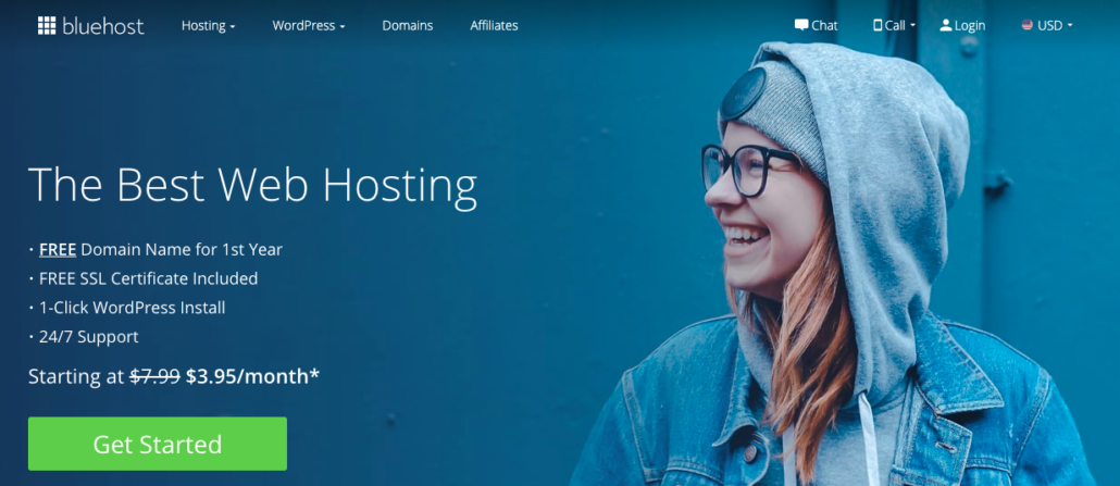
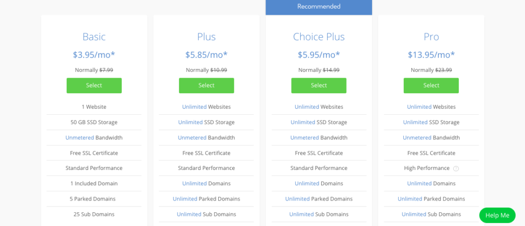
2. Click “Select” under the Basic plan
3. Type your domain under the left box “new domain”
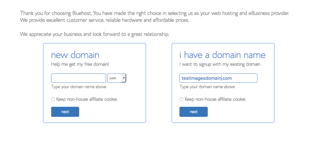
Then complete the registration process, enter your payment information, and you’ll get both a free domain and affordable hosting. That was easy.
Remember To Renew Your Domain
Domains often expire in 1, 2, or 3 years—depending on the package you purchase.
Why I bring this up is it’d be a shame to find a perfect URL, put time into designing a website, and add content every week, for it to then all go away because you forgot to renew your domain and another random Joe buys it.
It’s happened more than you think, even on a national scale.
During a presidential election, Jeb Bush and his team completely forgot to renew the domain JebBush.com and now President Trump, being a master persuader, bought the domain and had it redirect to his presidential election website.
To be safe, put your domain on auto renewal. Ensure your hosting provider has an email address that you actively check. And mark your calendar a month in advance of the expiration date to check on its renewal status.
Then you can be at peace knowing you’re safe from pulling a Jeb Bush.
Conclusion
That’s how you get a free domain name without having to pay for it.
In summary, technically you have to pay for hosting, but you’re not going to get free hosting anywhere that’s legitimate.
Better off paying for hosting and getting a free domain with a reputable company, than going with a sketchy provider who says they offer a free domain and hosting—with unfair strings attached.
Be sure to do your due diligence before you risk your domain and or website in the wrong provider’s hands.
That’s why we trust Bluehost. It’s a huge hosting provider that’s not going anywhere in the near future.
Enjoy your free domain!
Once you have your domain, here are some tips on designing a website that converts sales.
Disclosure: We sometimes use affiliate links which pay us a commission if you purchase a domain or hosting. This is at zero cost, and sometimes a benefit, to you.

What’s bounce rate? A huge Google ranking factor and it’s defined as the percentage of single page visits to your site. This term describes when a user will go to your site, visit only one page and then click away to another website. The goal is to reduce bounce rate.
Now not all bounces are bad. Sometimes a user may visit your site, get exactly what they need on that page, and then happily leave with a smile on their face.
Even though there are good and bad bounces, the goal is to have the least amount of bounces possible.
A high bounce rate can mean that your website is causing poor user experiences.
So it’s crucial you know how to reduce bounce rate to improve your conversions, SEO rankings, and visitor experience.
After looking at a variety of factors for our own website, we have compiled a list of 22 steps that will reduce your bounce rate immediately.
Steps To Reduce Bounce Rate
1. Invest in a great design for your website
Your website is likely where your customers will spend most of their time with your business.
They see one of your ads or find you in a Google search and are directed to your site.
I can tell you with confidence that if your website isn’t up to par, your bounce rates are going to increase. If you can’t even get your website together, how can they trust you to satisfy their needs?
A simple yet effective design can make a world of difference for the user experience. In fact, simple web design converts best.
2. Don’t use pop-ups
Pop-ups almost always make the user experience worse.
Pop-ups have a bad track record of causing viruses and taking you off the page you were just on, what a headache.
Some businesses will use pop-ups to stop users from leaving their site and make one last attempt to convert them to a lead.
I would recommend just avoiding them all together. Your quality content should be keeping the user on the page.
You don’t want your business to be associated with pesky, annoying pop-ups.
3. Improve loading speeds
Time is money. You know it, I know it and anyone that has ever run a business knows it.
In this case, the time it takes your page to load can cost you leads.
Most users will leave a page if it takes more than 3 seconds to load.
It would be a shame to lose customers day after day over an easily fixable 3 second-delay. Follow the guide we created showing you how to make your website load faster and you’ll be good.
Even if your pages load crazy fast, it never hurts to do some research to improve.
4. Make searching for things on your site a prominent feature
A lot of people that visit your website will have a goal in mind.
Whether that goal be to learn more about your company or buy a specific product, they need to have an easy way to find what they’re looking for.
Making a search box easy to find on your website can stop a user from leaving. Most businesses will include a search box in the upper right hand corner of each page.
If someone has to dig deep in your website to find what they’re looking for, they’re not going to trust that you’re a reliable business.
It’s all about removing friction for visitors and making the customer’s life more convenient will ensure that they have a positive experience.
5. Simplify your navigation
Your navigation is the journey a user will go on when they search for something on your page.
The goal of your header navigation should be to take the user exactly where they desire.
Nothing is more frustrating than looking for something simple on a site and going on a convoluted click-journey to get what should have been a simple answer.
Utilizing a simple navigation in the header will absolutely reduce bounce rate.
Chances are you’re not the only company that can answer the user’s questions. Failing to get the user where they need to be right away will push them toward your competitor in a hurry.
6. Offer translations for international traffic
Knowing the demographics that visit your site is so important.
You may be surprised to find your website attracts a lot of international traffic.
A lot of your bounces could be coming from people that can’t understand your content.
Making your website accessible to a wider audience can reduce bounce rate. Facebook does a nice job of this by having these language options in the footer.

An easy way to translate your site to a foreign audience is to download a translating software. This type of technology will take your site and translate it into the language of the person viewing it.
I’m guessing you haven’t even considered the possibility of attracting international traffic. In the end, it pays off to check the type of traffic you’re attracting every once in a while. Especially when you rely on making money from website traffic.
7. Revise your product pages
Your product pages or landing pages are designed to sell specific products.
The information on those pages can cause an increase in bounce rates—too much information can be overwhelming and not enough information can be off putting.
You want to make sure that your pages offer the price, description of the product, picture of the product and any other relevant information the user will need. Be informative and concise.
For example, if you’re selling clothing, you should include a size chart that will make sense to the user.
Adding customer reviews to the page can also help. People want to know what they’re going to buy has left others satisfied.
We have a post that offers more insight on what makes great product landing pages for more guidance.
8. Create a compelling C-T-A
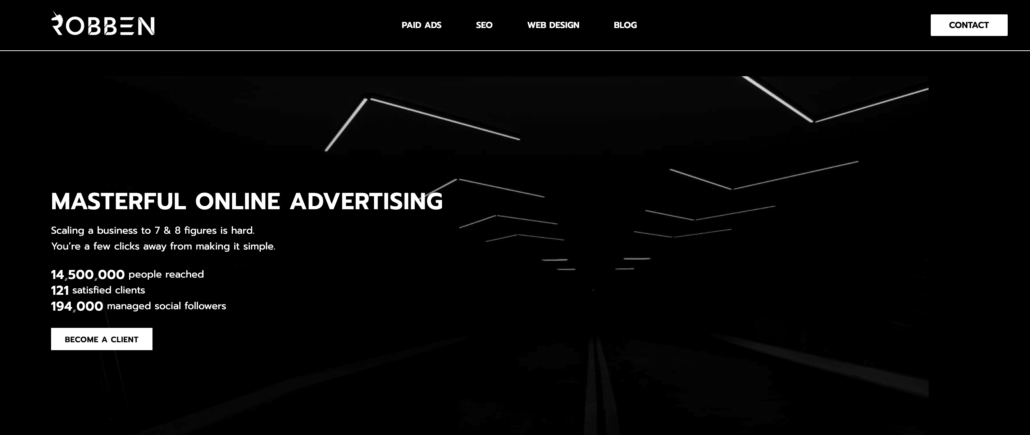
A C-T-A is a Call-To-Action. Basically this is the part of your page that should convince users to take further action on your website.
Only 47% of websites have a clear C-T-A that users can find in 3 seconds or less.
Many businesses will include a C-T-A on the homepage of their site that takes them directly to the product they’re looking for.
Take our website for example. On our home page there are two easy to find C-T-A’s. There is a “Become a client” button and a “Contact” button. When you click on each it takes the user directly to a form where they will put in their information that connects them to us.
C-T-A’s will take the user directly to the page they’re interested in. This way there is no chance for the user to lose interest because they can’t find what they were looking for.
9. Make 404 pages more than just error pages
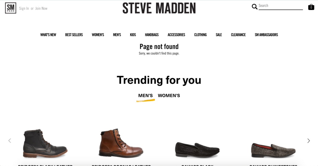
A 404 or error page is what the customer will be sent to if the enter an outdated or nonexistent URL.
This doesn’t have to be a dead end and shouldn’t guarantee an increase in bounce rates.
Instead, rework your error pages to offer helpful information that will keep the user on your site.
Add an option for the customer to search for something else directly from that page. Or provide your top 5 most visited pages.
You can also add recommendations for products similar to what they were originally searching for.
Taking this extra step shows your customers you care about them. You are going out of your way to offer alternatives to a failed search.
10. Make sure your site works on multiple browsers
Your website will appear different across different browsers. The way your site looks and operates on Chrome will not be the same as Firefox.
Collect data on your bounce rates for each browser and compare them. It’s always a good idea to conduct user tests on your website. You then need to take it one step further and run regular user tests on every browser.
This goes back to the idea of making sure your website is accessible for everyone that will be viewing your page.
It is a real pain to have to switch browsers because you know a website doesn’t work properly on the one you regularly use. That’s also a bold assumption that people will switch browsers just to view your site.
11. Make your website mobile friendly
It’s no secret that more people are relying on their mobile devices as their primary source for the internet.
Nowadays 57% of US online traffic is coming from mobile devices. And mobile users also have even lower patience than desktop users.
All websites look and operate differently on mobile devices. You can’t just hope that your site will work on a mobile device.
You have to design your website to be mobile friendly.
Once your mobile-friendly site has been up and running for a while, take a look at the total pages visited per visitor.
Then troubleshoot until you start to see improvement.
A website that is smooth across desktop, laptop, tablet, and phone will reduce bounce rate.
12. Check “double meaning” keywords
Now that your website is refined, you want people to be able to find it when they do a Google search.
Any keyword you choose to use for SEO should be relevant to your business.
However, sometimes your keywords might not be attracting the traffic you intended.
When you look at who is causing bounces, you might find that the keywords you’re using are attracting people that aren’t interested in your business at all.
Say for example you’re a craft store that is selling paint brush sets. You’ve set your keyword to be “brush sets”. You go to check your bounce rates and you see a lot of young adult women are causing bounces. You then realize that a lot of people are confusing your business for selling makeup brushes instead of paint brushes.
Make sure that the keywords you use are specific enough that they won’t have a double meaning.
It might not be anything you’re doing wrong, just an inconvenient misunderstanding.
(For more on this, check out our awesome keyword research guide.)
13. Update your content

If you’ve been doing this for a while, you probably have a lot of content on your site.
Some of your bounces may be coming from users that find your older content and feel it is outdated.
Going through your older content and either updating or removing it will make a major difference.
We suggest doing a Google search for “site:yourwebsite.com Year”. So for us this would look like “site:robbenmedia.com 2018”.
This allows us to easily find our older posts and revise them.
You especially want to check out your highest traffic posts. People found value from these posts and you don’t want that to stop because you failed to update outdated examples and information.
Blogging tip: Refrain from using seasonal holiday posts or specific years in your posts to help your content last longer.
14. Focus on your copywriting
Quality content is easily one of the most important aspects of any business. This is why our PPC agency focuses on copywriting.
It is important to keep the reader in mind when you write any content, but especially for your blog posts.
Good copywriting on landing pages has a few characteristics:
- Informational
- Concise
- Conversational
- Personable
Writing that takes forever to get to the point will guarantee to increase bounce rates.
Good writing will also convert leads and bring users back to your page.
15. Write in short paragraphs
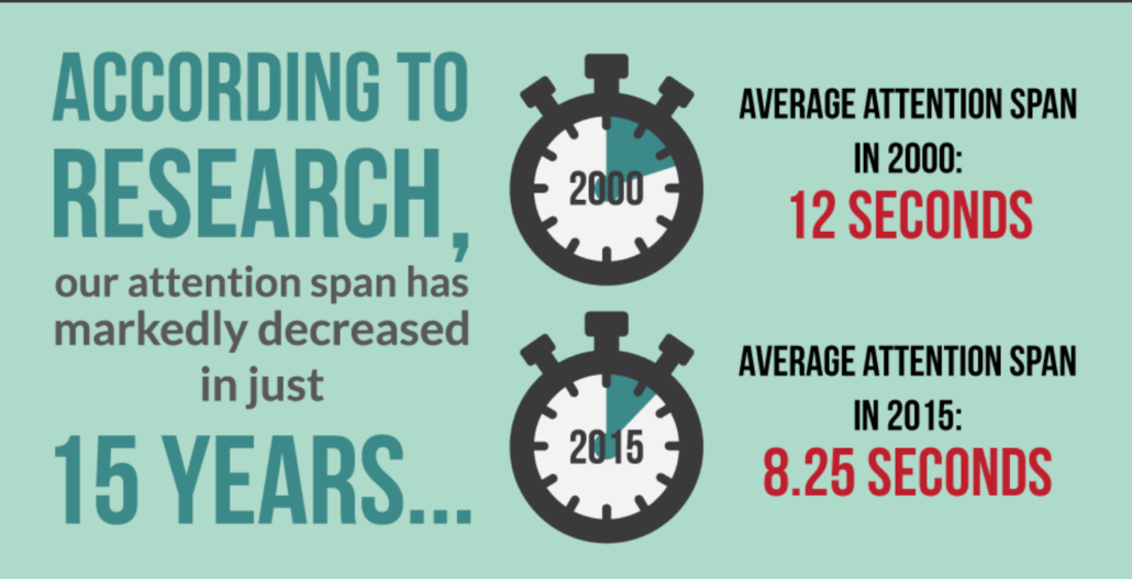
The human attention span has decreased by a quarter in the past 15 years. Wild, right!?
Long paragraphs are an immediate turn off for people.
We physically no longer have the attention span to sift through paragraphs and paragraphs of mass information.
Short paragraphs make it easy for the user to find the information they need.
It also makes the post look more organized and less daunting.
I know when I see a post that has long paragraphs of pure text, I’m less likely to keep reading.
Shorter paragraphs will invite the reader in and encourage them to continue returning to your page.
16. Improve your copy’s readability
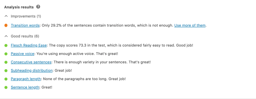
We use WordPress to publish our blog posts.
We have a plugin called Yoast that checks the readability of our post before we publish it.
Readability consists of a few factors:
- Sentence length
- Paragraph length
- Passive voice usage
- How easy or hard your text is to read
- Number of transition words
Before we publish a post our goal is to make sure our readability score is good and shows green. Green means that it’s good to go and will be a pleasant read.
Better readability reduced bounce rate and also encourages people to continue reading your content.
17. Split longer posts into a series
Sometimes you just have a lot of information that you want to fit in one post.
When you publish an extremely long post, you run the risk of losing the interest of your audience half way through the post.
Instead of publishing one long post, posting a series of posts can be an alternative option.
A series of posts will break up all the information you wanted to share into posts that are easier to read.
This option will actually offer even more benefits than just keeping the reader on the page.
Series can build anticipation because the reader does want all of the information, just over a span of days or weeks. Since the reader is now intrigued by what you have to say, they will keep returning to your page to get the next chapter of information.
So, not only are you reducing your bounce rates, you’re also increasing repeat visitors. That’s a win-win.
18. Offer content recommendations on your posts
A great way to keep people on your page is to offer them more of your related posts.
You can add a plug-in to your website that allows you to put your other posts with the current post the user is reading.
Some businesses will include some related posts at the very end of the copy, some will put it on the sidebar and some will include related posts at the end of each section.
Where you decide to put them is really up to you.
This allows you to offer the reader more information related to what they originally searched without leaving your page and finding another business to give them what they want.
Keeping people on your page is the ultimate goal to increase on-site time.
19. Add more internal links
Internal links are links to your own website pages and posts. Writers use them to provide extra information on a topic.
For example, whenever I write a post that talks about Facebook paid advertising, I’ll link one of our posts about paid advertising instead of using another businesses post about paid advertising.
It’s better for the reader to get information from you than your competitors.
Using internal links also takes the user to another page on your site, taking away the opportunity for them to become a bounce.
20. Make all external links open in a new window
Bounces can come from your external links.
If you don’t set them to open in a new window, the user will be directed away from your page. That makes them a bounce.
Why would you willingly send the user away from your page when you don’t have to?
Directing the user to a new page also discourages the user from returning to your site.
If you use WordPress like us, it is super easy to avoid this by opening your external links open in a new tab.
All you do is link the page to the words you want associated with it then click on link options. From there all you have to do is check the box that says open in a new tab.
21. Reduce your broken links
Broken or dead links can be caused by a variety of factors.
It is important to regularly check all of your pages to make sure the links still work. When pages on your site don’t work, your bounce rates will increase.
There are sites and programs that you can download that will identify and fix broken links on your site.
Implementing one of those options is convenient and often worth it if you know you have an older site with a massive broken links problem.
You should also check the external links you use in your posts to make sure none of them are broken. Leading a user to a page that no longer works can also cause a bounce.
Having no broken links is ideal but reducing the amount to as few as possible will do the trick.
22. Let your customers speak for you
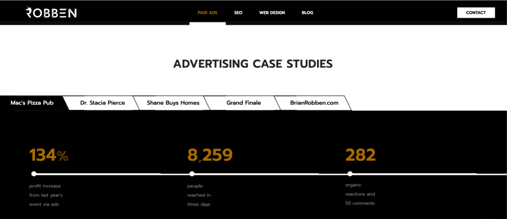
It’s no secret that prospects appreciate seeing other customers’ experiences with your company.
Stats like above and quotes allow you to tell a min-story to build trust and makes what they have to say more interesting and personal.
A wise move to reduce bounce rate and take your customer testimonials a step further is to make them into full on success stories. You can do this by adding a page to your site that is dedicated to what your customers have to say about you, then linking to it from the shortened, mini-testimonials.
So you start with just quoting what the customer had to say on a page but the goal is to embellish it and share their entire journey in a new page that is linked from the shortened version.
Don’t feel uncomfortable about bragging about your company. Prove to the visitors on your site that you will take them to where they need to be.
Conclusion
There are so many different possibilities to reduce bounce rate and those pesky one-page visiting users. You just need to be willing to put in a little extra time to try some things out.
You now have 22 different solutions under your belt.
Take our advice and know that when your bounce rates decrease, your business grows.
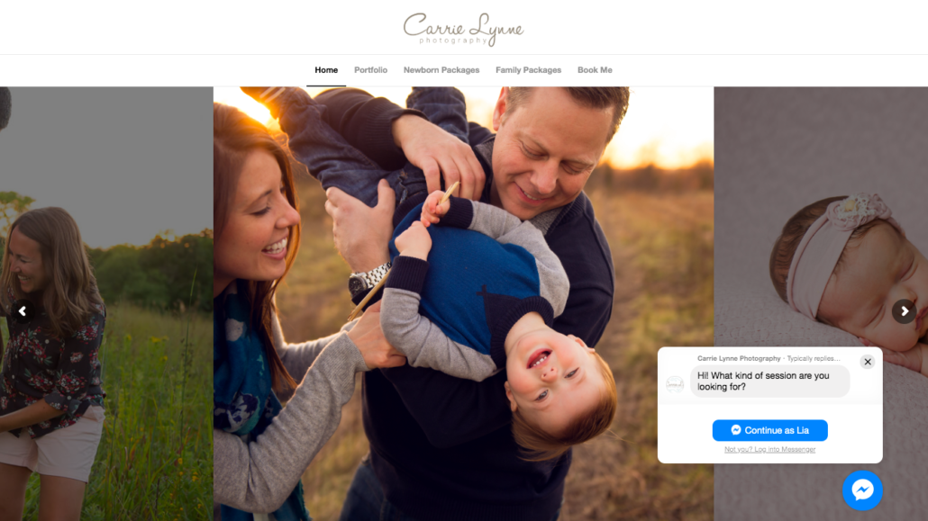
It’s no secret that software is eating the world with the help of SaaS marketing tactics. The right digital solutions, like a business chatbot, will always outperform humans and save company’s money.
Take for example:
- Online video games replacing in-person arcades
- Digital photography is omnipresent replacing old-school film and Kodak
- Artificial intelligence hedge funds are outperforming human stock pickers
- The military uses drones and radar technology instead of sending human pilots
- Self-driving cars will replace Uber drivers
Every day there is a new technological advance. Whether you like it or not, technology plays a huge role in the world of consumer habits, marketing, and running a successful business for the long term.
So you can either adapt to the new technology and grow, or be stubborn and eventually die.
We’d prefer that our customers and you adapt to make friends with technology instead of fear it.
Wouldn’t you like to take advantage of technology to help your company generate leads and increase sales?
You can run ads to funnels and webinars, which we love prescribing. Or you can install a chatbot on your business website to give customers something they love.
Speaking of a chatbot, it’s a fact customers love them.
Live chat not only has the highest satisfaction level compared to email and phone but 63% of consumers reported they are more likely to return to a site that has live chat.
The results are convincing business owners that chatbots are the way to go.
Not convinced a chatbot is for your website? Keep reading and maybe we can change your mind.
Why Add A Chatbot To Your Site
1. Huge Money Saver
The chatbot is a 24/7 automated customer service representative.
Meaning you don’t have to pay a virtual assistant, or even worse an in-house employee, to answer customer service questions by email or phone calls.
This leads to the biggest reason why business owners in the know are all about chatbots: A study by Juniper found that business chatbots will likely save $8 billion in costs by 2020.
When you hear cost-savings of $8 billion, it’s no wonder 80% of businesses plan to launch their own chatbots by 2020.
The math behind this is, according to Glassdoor, the average customer service rep makes about $35,000 a year.
The chatbot does the same job as a customer service rep and is available at all times of the day, including holidays. It performs better and never needs a break, health insurance, or a pay raise.
By enabling a chatbot, you save your business tens of thousands of dollars per year at the minimum per customer service rep you would have had to pay. If you’re a large corporation paying millions in customer service, you could now save millions.
The money you save with a business chatbot can go towards improving your business or go back to shareholders.
Taking an opportunity to leverage technology to improve your business and save you a boatload of money is a huge win to kickoff this list.
2. Supports The Customer Experience
Consumer expectations are changing as they get more options and become more educated. The result is it takes a lot more for businesses to stand out in the consumer service arena than before.
These are high-stakes games, as the consumer experience is what can make a world of difference for, or against, a brand.
With many businesses competing in the commodity business, the winners come out on top based on customer service and branding.
Really think about it. When was the last time you had a bad customer experience and decided to return to the business? Chances are, the good customer experiences you have are the ones that earned your business for decades to come.
And we all know customers respond well when they feel like they’re a priority.
By implementing a chatbot, you are ensuring that the customer is a priority every time it wants to be.
First impressions are pivotal, and having a representative of your brand there available to answer any questions makes all the difference in the world.
The typical customer journey has unnecessary friction, often times making it hard to find information or purchase what the consumer wants to. Throughout that process there are ample opportunities for the customer to decide it’s not worth the hassle and leave your site.
Chatbots are cutting out that unnecessary friction and guiding the customer to exactly where they need to be. Of course, website visitors love the more convenient path.
Customers take note of brands that go out of their way to make their experience the best it could possibly be. In fact, 9% of Americans said they would spend more time with brands that provide superior customer service.
3. Automates And Drives Lead Generation
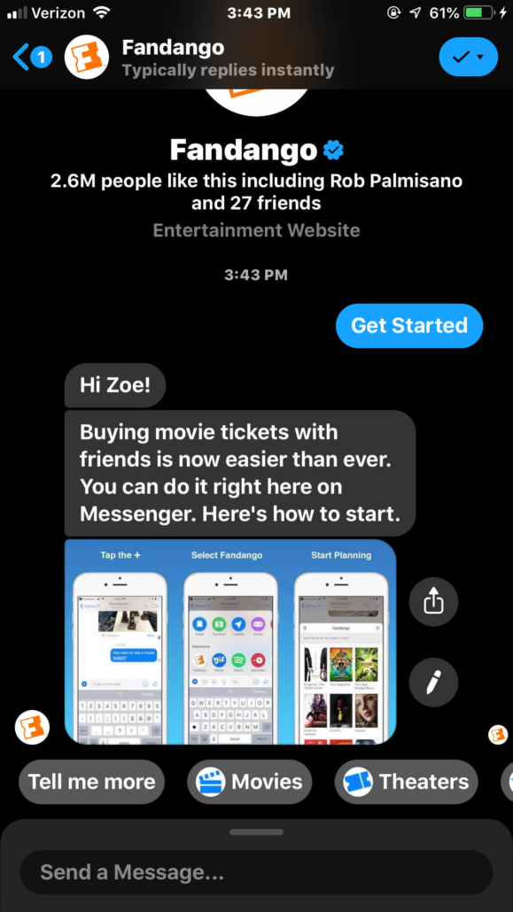
Out of all the reasons listed above, the fact that chatbots generate leads is their best asset.
Here’s why they generate so many leads:
- They’re instant. They offer assistance immediately and are always available for the consumer.
- They answer consumer questions in real time. There’s no waiting for a phone call or an email.
- They discuss only relevant content. It takes out the need for a customer to search through your website to find what they were looking for.
- There is no need to fill out any forms. The bot gets the lead through a conversation. It doesn’t require the potential lead to fill out a bunch of forms about their information.
In fact, companies that use chatbots have found that it is their #1 lead generator.
Business chatbots deploy artificial intelligence, so they don’t require someone to manually control them.
You can also use your chatbot to push for sales.
Imagine you have a customer that keeps looking at the same product on your page but hasn’t bought it yet. You can give your chatbot the ability to message that customer some encouragement to buy that product via another customer’s review or a special promotion.
This can replace seemingly pesky Facebook ads. Instead your bot is reaching out to the customer with relevant content.
Once you set it up, the bot runs on its own to complete the job at hand.
You can choose from three different categories of bots:
- Personal: This type of bot is designed for a one-on-one experience between a single user and the bot. This can be good for simple questions and basic information.
- Team: This type of bot is designed for a one-to-many experience between multiple users and a single bot. This likely won’t be the option you choose to automate the lead gen process.
- Domain/Brand Specific: This type of bot is designed to be used when a service needs to go into detail. This will likely be the option you choose to automate the lead gen process.
Once you decide on your type of bot and get it running on your platform of choice, it will start to generate highly-qualified leads.
Whether it be from a consumer clicking an ad or someone just visiting your website, you can decide when and where it should be activated. For example, you may decide it makes the most sense for the bot to pop up on the screen in 5 seconds. Or you may have it preloaded from the start of the visitors viewing experience.
Your chatbot can identify leads. Immediately it starts asking the customer basic questions (What type of room are you looking for?, How many people will be at your event?, etc). From there it’s just a matter of reaching your sales team.
Automating the lead gen process is great news for your business. While the business chatbot does the heavy lifting, you can focus on your sales team’s conversions with these leads or other aspects of your business.
Just like you’d get renters insurance to protect your things, a chatbot can act as insurance to protect your investment in lead gen.
4. Builds Brand Trust
When you are creating your chatbot, it is vital that you understand how your customers think and process information.
You don’t want to overwhelm them with a chatbot that asks a bunch of questions without giving them a chance to comprehend what it’s saying.
You also don’t want to give them too little information where the chatbot becomes a deterrent to their experience rather than adding value.
Lesson being your chatbot should never be an inconvenience to the consumer.
People already prefer messaging as a means to communicate with a business. According to a study done by Nielsen, people say messaging is the second best way to communicate with a business.
Every interaction adds to the idea that your brand will add value or take value from the customer. Having a chatbot to answer questions and support their browsing or buying experience is a nice value add that will pay dividends through the lifetime of the relationship. (And each positive experience will increase your customer lifetime value.)
Good interactions equals increased trust and high sales volumes. Bad interactions equals them spending their money with your competitors.
Chatbots will subconsciously give them the assurance that if you’re able to provide pre-sale support, you’ll also be there for post-sale questions and any customer support needs they may have.
5. Produces Quicker Response Times
The internet has created a monster.
Because consumers can now receive videos from their friends, pay bills, watch movies, and order concert tickets all in seconds—they expect everything will happen immediately.
No we have a society where instant gratification runs rampant.
The problem for businesses is this need for speed has entered the marketplace as well.
If your business isn’t fast to respond, customers can feel like they’re not a priority and vow to never buy from you.
People expect to always get a response and to get what they need right away.
This can quickly cause problems, especially after operating hours.
Here’s the reality, you have about a 15 minute window to respond to a customer before you lose that sale and the lead turns cold.
That sounds crazy I know. What if you’re in a meeting and you can’t respond right away? What if they try to contact your company after you’ve already gone home for the day? You can’t always be expected to have your phone on you, right?
That’s the beauty of business chatbots. They offer assistance immediately.
People are more likely to ask a question and build a relationship with you if the chat box is right in front of them as opposed to them having to search for the contact page, submit an email, or other lesser solutions.
Constantly having a business chatbot that is available for questions and assistance at all times will resonate well with your customers. It makes them feel like your top priority, which they should be.
Your business will not run without your customers, that’s just a fact. Why would you risk losing business to your competitors because you weren’t available when they needed you? Set up the chatbot and rest easy.
6. Collects FAQ’s To Improve Your Website
Just like many other digital marketing techniques, chatbots allow you to collect data about your prospects and customers directly from the source.
If the majority of the messages you receive from your business chatbot show confusion about your pricing packages, or they can’t find the page, now you know that you need to make your pricing packages more clear and accessible on your website.
If 19 messages in a row are asking when you’ll be back in stock with the cheetah skirt, then you know that’s a hot seller and to order a shipment in bulk next time for that apparel design.
In these instances, your chatbot is pointing out the changes you need to make to your website. And often, saving you from what would have been missed sales opportunities.
Not only will the chatbot provide you with valuable information about what is confusing your website visitors, but it will also stop customers from leaving your site when they don’t see the information they were looking for.
7. Improves SEO
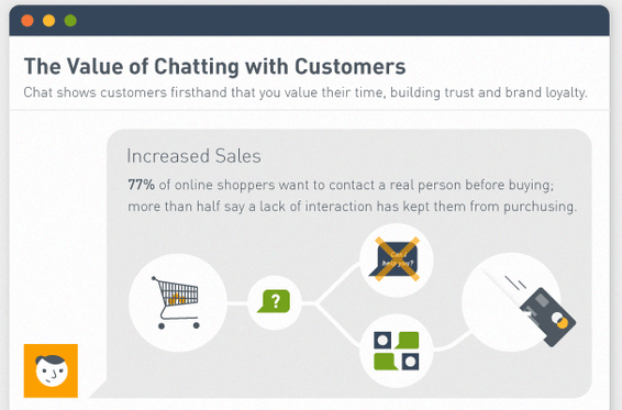
Let’s say you plan for a short 30-minute lunch so you can get back to work to finish your to-do list. But then you meet an old friend in line ordering and talk for another hour longer. As you get back to work, you’re left wondering where the time went.
What happened? Conversations make people lose track of time and invest more energy than they consciously recognize.
Using a business chatbot has the same effect on a customer.
They may have the intention of visiting the site to briefly look around. Then they get wrapped up in the chatbot conversation and end up asking five more questions, explaining their wish list items, and buying three more items.
Answering questions allows you to keep people on your site longer and decreases bounce rate. A bounce is when a user clicks to your website and quickly clicks away after only viewing one page—a negative ranking factor for SEO.
So the more questions your chatbot can answer and the more pages it recommends the visitor clicks, it decreases your bounce rate and increases their on-site time.
Visitors spending more time on your site also increases the likelihood that they will come back to your site.
After those reasons, hopefully by now we’ve convinced you to set up a business chatbot.
How To Set Up A Business Chatbot
You’ll be happy to find out that building chatbots is a relatively easy process. It requires no programming experience.
Before we go through the steps of setting up a chatbot, let’s discuss the different types of bots.
There are two main types of chatbots:
- Simple/Scripted: This bot has pre-programmed responses to questions it’s asked. This chatbot cannot deviate from the responses you program.
- Intelligent: This type of bot provides flexible responses. It takes what it learns from each conversation to answer future questions with more accuracy. It can only give answers, however, it cannot lead the conversation.
What you decide to use depends on what your goal is for the chatbot with your business.
You should also know the elements of a great chatbot:
- Persona: You want to create a personality for your chatbot based on what works well with your customer base. This is another reason it’s important to know how your customer thinks. You also want the persona to be warm and engaging.
- Waiting time: This makes the experience more human. You want to give the customer time to process the information that has been given to them before you hit them with more information.
- A/B testing: Like an advertisement, you should create multiple versions and test them to see what works best for users.
- Avoid mass texts: Much like the content you created, you want to avoid sending paragraphs of text because that can be overwhelming for the customer.
You can choose between
- Facebook Messenger
- Slack
The most common source companies will activate their chatbots on is Facebook Messenger.
Almost everyone nowadays at least has a Facebook account.
Setting up your chatbot on Facebook Messenger offers convenience for your customers because they don’t have to go to a separate site to talk with your bot. The downside to using your bot on Facebook is that not everyone is going to find your business through Facebook.
Unless the consumer is on your Facebook page, they’re not going to interact with your bot. This means you’d have to install the Facebook Messenger chat on your website using this guide. Slack and WhatsApp are similar in the sense that they are separate from your website or your Facebook.
Slack is great because it can help you create your chatbot and it also allows you to decide where you’re going to upload it. It lets you choose from Facebook to Slack to a chatbot on your actual website.
However it is a separate site that customers would have to go to reach your site and you don’t want to run the risk of losing a lead because you lengthened the customer journey.
Same goes for WhatsApp. WhatsApp is a messenger app that allows you to talk with people out of the country without having to pay extra fees. This is an ideal tool for speaking to a wider audience. You do however run the risk of losing leads because it is an extra app that your consumers would need to download to talk with your bot.
Now that we’ve discussed some aspects of the chatbot, let’s talk about how to create it.
1. Pick A Preferred Software
The first step is choosing a software to help build your chatbot.
The good news is that there are tons of websites that are free to use and walk you through the process.
Two popular softwares are Chatfuel and Manychat. Both are free and user friendly.
If you don’t like either of those just do a quick Google search for chatbot platforms to find yours.
2. Plan The Onboarding Experience
Your next step is to figure out what the consumer is going to see as soon as the chat box is opened.
There are two types of text you need to consider:
- Greeting text: This is what will come up as soon as the chat box is opened and before any interaction has started. This could be an introduction of who the chatbot is and what your company provides.
- Welcome text: This comes after the user has started a conversation. This could be what you’re offering with option buttons to continue the conversation.
Whatever you choose to say should resonate well with your users. You want to keep the user invested in the conversation.
3. Create The Main Menu
This is the most important element of the chatbot.
The main menu will guide the user in the right direction.
Each button that you choose to include should launch some form of action.
Whether it be the answer to a question or a new product you’re advertising, the button should lead the user to some type of direct action.
You’ll be successful when you put yourself in the shoes of the prospect and imagine what they’d want to know right away. Then, give them that information. You’ll immediately win over new fans.
4. Select Keywords
You may be wondering how the business chatbot knows what to say.
You can pick different keywords that prompt the chatbot to respond with the response you programmed into it.
Examples could be the user saying “more info” and the bot responding with all the information about a deal they were interested in.
This is what creates the conversation between the bot and the user.
5. Set A Default Reply
This is the final step before your bot is ready to go live.
Sometimes people like to test the capabilities of the bot.
There is a way to combat this. You can set default replies that the bot will send if they get a “text” that they don’t recognize.
This will avoid a period of silence for the lead to leave the page. This will also help to get the conversation back on track and make it clear its capabilities.
Conclusion
The tried-and-true way to scale a business is to automate and systemize your repeatable processes.
By setting up a business chatbot, you have an asset that automates lead generation, sales, and customer service. Those are three huge components of any thriving business.
We want to see your business succeed. That’s why we’re pushing you to build your own chatbot.
If you’re still not sure or if you’re wary about creating it yourself, consider working with us to get yours up and running. We’ll do all the set up and conversion optimizations for you.
Cheers to improving your business—one digital solution at a time.
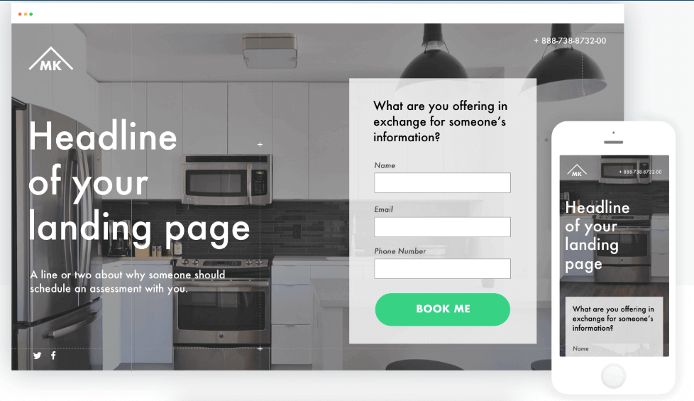
Unbounce Shows A Landing Page Done Right.
Regardless of your industry or your audience, there’s simply no excuse not to have an amazing landing page that converts.
If you’re not familiar with digital marketing vocabulary, you may be asking what’s a landing page? And what’s a landing page that converts?
A landing page is a term used to describe an individual page on a website that was created for a specific advertising or marketing campaign.
Smart companies will create a unique landing page that matches their advertisement instead of sending all users to a generic homepage. Doing so improves sales and email captures.
An example of this is Nike running a Facebook ad special for 20% off running shoes during the weekend. When users click the link from the Facebook ad, it takes them to a landing page that reiterates the 20% off special and has a catalog of running shoes that match the offer.
Without that specific landing page, the advertisement would confuse users who click from Facebook to the generic Nike homepage and see nothing about 20% off for running shoes. That’s poor marketing.
And creating and maintaining a page like this has never been easier or more accessible. Plus, customers increasingly expect legitimate businesses to have a page that matches the ad, social media link, or email newsletter link they just clicked on.
But just because landing pages are mandatory doesn’t necessarily mean they have to be a labor-intensive project.
A simple one-page website can be extremely effective at making an impression with consumers and even driving sales. Every small business should be excited at the thought of this.
With a little design know-how and a clear strategy, a clever and concise landing page can be the perfect way to make an impression. This is one without spending dozens of hours or thousand of dollars on a more traditional web presence.
Looking for the right place to start? You’ve come to the right place: just following these simple instructions will help you start developing your landing page the right way to maximize your new marketing campaign.
Creating Amazing Landing Pages That Convert
This Wistia Page Is Well Thought Out.
1. Know How You’ll Measure Success
It can be tempting for business leaders to grab a new domain name put together a site as quickly as possible. This is more prevalent with the dawn of incredibly intuitive web design tools like Squarespace.
However, even a simple landing page is worth investing strategic thought into. It’s much easier to make sweeping changes at this early stage. And by spending a little extra energy before you start to implement your vision, you’ll be ensuring that the final result is far better at achieving your goals and helping you grow your business.
Like many branding projects essential to a small business, I encourage approaching the design puzzle that is your new website by starting from the outcome.
A good starting point is to ask yourself or your team the following questions:
- Ideally, after interacting with your landing page, your potential consumers will do what, exactly?
- What about the design and organization makes them feel strongly that they have to do that thing?
- And when they do that thing, why is that useful to your company?
- What happens after they’ve done it?
Until you can answer these questions in a concise and specific way, you shouldn’t even start thinking about layout or functionality.
This is really the core of what will make your landing page either a critical tool for your business or a waste of your time.
A lot of business don’t think strongly enough about the emotional experience of their users when starting web design. And the overwhelming majority of the time, it’s obvious (in a good way) when they have.
These pages will provide the usual value that any good website does. But they will also take additional calculated steps. Companies who succeed in this manner will remember why customers value their services and then incentivize those users to behave in specific ways.
If you can nail this step, it’ll maximize the impact of everything else you do as you build your site.
2. Maximize The Bare Minimum
Maximizing the bare minimum is actually something that I find myself reflecting on incredibly often. Both in design meetings with customers and also while interrogating my own creative process.
Matias Duarte, who currently serves as Google’s Vice President of Design, offered this pearl of wisdom when introducing the then-revolutionary Material Design to the team at The Verge.
“One of the design practices that we like to follow is try to design the simplest possible thing for the user first. See if you can get away with that, prove that you need more complexity before you add it.”
This minimalism mindset applies to just about everything in design. But is especially potent when designing a landing page.
Now that you understand the specific feelings and behaviors your website needs to evoke from your consumers, it’s time to narrow down to the absolute simplest, most concentrated method of engineering those outcomes.
What are the fewest elements you can use to create this impact?
Creating a landing page with at least some degree of complexity isn’t necessarily a bad thing. But details that do not provide actual value to your consumers are wasteful and distracting. They water down your offer and limit the effectiveness of your design.
Remove them: nothing should be off limits.
In this section, I am challenging you to engage to create something that embodies your vision so perfectly that to change even a single element would threaten to tear the entire thing down.
If you go through the difficult process of revision and re-revision, you’ll develop an incredibly persuasive landing page.
3. Differentiate With Design
Trulia Gets To The Point.
At this stage, you should have a clear mission for exactly what your landing page does, how it does it in the most efficient and elegant way, and why doing what it does is a good thing for it to be doing. You’re in the home stretch. Now it’s time to make the damn thing.
On a basic level, you already understand exactly what needs to be done here thanks to your detailed work thus far. But one thing I haven’t touched on yet is design.
As I’ve repeated before on this blog, the medium is the message. And this landing page is absolutely no different.
If you don’t bring an impressive aesthetic sensibility to the table here, you face the threat of undercutting all the hard work you’ve already done.
With luck, you’ll already have thorough brand guidelines for your business, including colors, typography, and brand tone in your copywriting.
In any case, your focus should be on creating something distinctive (this is your webpage after all, it should stand out) that also feels well at home within the context of your brand’s other output.
Maintaining continuity by using colors and logos in your existing branding is a great way to make this connection visually.
If you’re looking for inspiration, there’s plenty of free resources available for you on the Web. The Awwwards archive of single-page websites offers incredible design direction that ties into your existing branding and stops users dead in their tracks. Or look at some of your favorite sites across the world, like Apple’s iPhone, for their landing pages.
And with your design direction set in stone, you’re ready to start executing. Go ahead and share that URL far and wide.
4. Keep Refining
So, you’ve shared that URL far and wide. Hopefully you’ve received some really thoughtful compliments from friends and even potential consumers about your hard work. That’s awesome, you’ve earned them.
But what you should be really interested in is the negative stuff. Not because you’re a masochist.
Because those negative comments (combined with your own analysis) are the raw materials from which you might start to construct the next version of your landing page. And this will make this one look like kids’ stuff.
By approaching this task in this manner, focusing in with excruciating detail on a careful analysis of who you think your consumers are and your brand should be, you’re bound to have made mistakes.
Learning about those mistakes, which can sometimes come from deeply-held assumptions about your product, your company, and your consumer base, at this stage in your website launch process, has the potential to prevent mistakes that would otherwise be extremely costly.
Realistically, there are thousands of ways to build a landing page that require less time and effort. Just grabbing a Squarespace template and going to town for 25 minutes would get you most of the way there.
But those landing pages won’t really help you run a better company. They don’t require you to think about your brand. Or consider the relationships it embodies from new ways. Nor think through the lenses of user experience and visual design to persuade the most visitors to buy from your business.
And most critically of all, they won’t show you the things you’re doing wrong as you try to tailor your product or service to the market.
Really, that’s how you end up getting the conversions that matter. By consciously iterating not just your product offerings and website layout, but your understanding of the marketplace itself and how you fit into it to the point of maximum value.
That’s next level strategy. And what follows are unique profits.
Ready to get started building your new landing page? Our PPC agency will make you more money.
Is your business without a website? Thinking about updating your business site or designing a new one?
Spending time on the website navigation menu design doesn’t often come up first, but maybe it should.
What often comes to mind tends to be the visual element of design. Things like colors, typography and imagery.
Run a Google search for “website design inspiration” or something similar, colors, imagery, and layout are things others will recommended to you from a wide number of sources.
These elements of design are obviously important. And they go a long way toward ensuring your website makes an impression on the people that matter. But web design, when it’s done right, actually goes quite a bit further than that.
Designing your website’s navigation menu with the right touch may be the unsung hero of website design. Often overlooked, they’re one of the most critical features of almost every kind of website. As they literally determine whether or not users can find the pages you’ve worked hard to put online.
They’re unique for another reason as well. Navigation menus are one of the few elements of a website that depend on any given user being able to understand how to control them perfectly with minimal (if any) instruction.
If you’re looking through a website and have trouble adjusting the settings on a slideshow or photo carousel, for example, there’s a pretty good chance you’ll continue to use the website anyway. But if your navigation menus are too complicated or too obscure, visitors will click away in a second. Messing this up makes your site functionally useless.
And beyond the user interactivity side of things, site navigation can also play a surprisingly major role in the way you rank on websites like Google, Yelp, and mapping services. The way you organize your pages — and how well you communicate that organizations to the software that determines search rankings — is critical.
So what sets excellent website navigation menu design apart from the rest? And how can someone building a site ensure an amazing visitor experience?
The good news is that learning the do’s and don’ts of excellent navigation design doesn’t require a lot of complex technical knowledge or design skill. It just takes a firm understanding of current design standards and how they apply to various types of websites.
By following these steps, you’ll be well on your way to designing a website navigation menu that features gorgeous, simple-to-understand navigation that anyone can use effectively.
1. Organize Your Site’s Content
This one might seem a little counter-intuitive, but it makes a big difference down the line.
Before you decide on how people will navigate your completed site, start by thinking about the actual content they’ll be navigating to first.
Think about all of the things your website needs to accomplish. Anything from showcasing images of your work to allowing people to make purchases directly. And then bundle those features and elements into individual pages in a manner that’s easy-to-understand.
Clarity is the most important thing here. Too many or too few webpages can confuse visitors and drive them away. You should feel like anyone could find roughly anything they’re looking for with little possible confusion.
You could use a platform like Trello or Asana to manage a project like this. But personally, I prefer to write out each page and roughly what content it features on post-it notes and physically move them around.
Approaching your web design project this way will ensure that you’ve already thought deeply about various configurations and ways of conveying information to users before a single line of code is written. It’s far easier to move webpage sections around, or remove them completely, at this stage of development.
While you’re doing this, one critical thing to keep in mind is that you should have a top-level page for every major thing your company sells or your website should accomplish if possible.
This can have a game-changing effect on your ranking in many kinds of searches.
To use Robben Media as an example, we’re making it a priority to have separate pages for our web design, SEO, and marketing products. This way, Google searches for “Cincinnati website design” or “local SEO Cincinnati” point to our website as efficiently as possible.
2. Pick a Navigation Style That Fits
Once you’ve put together a sensible map for your site, it’s time to start thinking about how the navigation menu will look.
There are many styles of navigation menu, and each brings their own unique features and benefits. Any one of these menu styles might be a great choice for your website, so long as you ensure that you only use one.
Using more than one menu style across your site is a sure fire way to confuse visitors. Your navigation menu should be as consistent as possible across pages.
Option One: Left-Aligned Top Navigation

When you think of “website navigation”, this menu style is probably the first one that comes to mind.
It’s basically the “default” way to design a menu. Logo on the left and a handful of options or buttons on the right, with the logo redirecting to the homepage.
You might also be familiar with minor variations to this style. The menu items on the right might reveal a drop-down menu of more options when a user hovers over them.
This is a simple, versatile menu layout that can work well for a broad number of websites.
Option Two: Center-Aligned Top Navigation

This one is pretty similar to left-aligned top navigation, but with a key difference: now, the logo is in the middle with a symmetrical selection of options on either side.
This method of navigation is a little more eye-catching and places your logo right in the center, but also has its own unique caveats. You’ll need an even number of top-level navigation options and CTA buttons don’t quite look right in this context.
Ultimately, if you have simpler goals for your navigational system and want to inject a little bit of style, this is a compelling choice.
Option Three: The Hamburger Menu

The “hamburger menu” is the name for that three-lined icon in the top left corner of websites and apps. This is a menu navigation option that is really interesting because it enables your navigation to work exactly the same on both desktop and mobile layouts.
That’s a big deal, but it also comes with some big caveats. Typically, hamburger menus take up the entire right side of a display when fully expanded.
If consistency across multiple form factors or jumping on board the latest web design trends is high on your list of priorities, this is a great option.
3. Nail the Details
No matter menu option you select, your ultimate priority should be to keep things easy to understand and access. After all, simple websites convert best.
There are small embellishments to these navigational systems that you might find useful as well. The previously-mentioned drop-down menus are one example. Another is the small bar on top of the navigation menu with links to social media.
Both of these can be fine additions, so long as they add meaningful functionality.
Some do-it-yourself website authoring tools like Wix might encourage you to add in build-in or build-out animations. Though I’d encourage you to exercise caution unless they’re extremely unobtrusive. Nobody is happy it took an extra three seconds to load a page because of an unnecessary, pretty animation.
I’ve mentioned this quote before, but it applies just as well here for designers. Matias Duarte of Google said, “prove that you need more complexity before you add it”. If you apply this principle to your design process, I’m confident your result will be perfectly useful.
Well, at least, I’m confident your result will be useful on desktop. How should web designers factor mobile design into their navigation strategy?
With the exception of a sitewide hamburger menu, you’re probably going to have to implement a user interface for your navigation menu on Mobile that’s at least slightly different. Putting your navigation behind a hamburger or a drop-down are common choices.
You might feel tempted to mirror your desktop experience to mobile as exactly as possible, but I’d encourage caution. Instead, focus on implementing a navigation option that will instantly make sense to mobile users. This way, even if your implementation differs slightly, you’ll have achieved a consistency of experience.
Website Navigation Design Summary
And that’s really what designing flawless navigation menus is all about. Making it easy for visitors to find information on your website as fast as possible.
Follow these steps to properly design your website navigation menu. Then your visitors will find your site fast to load and easy to use.
And this will contribute to more sales generated from your site, without a doubt.


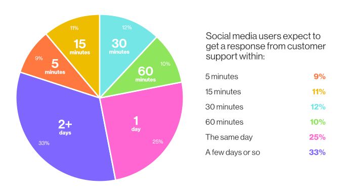 Source